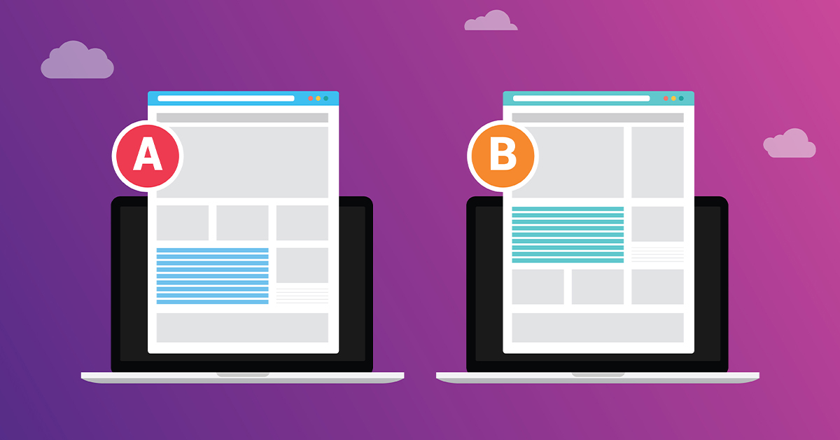
Even if everything about your landing page is on-point, there could be improvements to make, and you won’t know without A/B testing.
A/B testing is one of those industry terms that sounds a lot more complicated than it actually is. It’s essentially the practice of changing a given aspect on your website and seeing how it performs compared to the original.
Figure Out Which Data Points You Want to Collect Before A/B Testing
Before you begin testing, you need to know which data points you value most. You need to have data to know whether or not the changes you make to a landing page are achieving the desired results.
For landing pages, you’ll most likely want to track conversion rate, bounce rate, and average time spent on the page. You’ll either be able to access this information through the back end of the website or by setting up Google Analytics.
If you’re still creating and publishing your landing page, allow for some time for the initial page to collect data. Give the page one or two months. Then when you make a change for the A/B test, wait the same amount of time so it’s an equal comparison.
Only Test One Aspect of The Landing Page at a Time
If you change multiple aspects of the page when conducting an A/B test and find that the new page performs better, you’ll have no idea which change caused the improved performance.
When A/B testing, you’re conducting an experiment on your landing page. Science teaches us that in an experiment, there should be just ONE independent variable, the variables you control.
For example, you could start by testing two different calls to action, and then once you’ve found which one performs better, you can start comparing how different images perform. It will take a series of A/B tests before you arrive at the perfect landing page.
Different Components of Your Landing Page to Test
Having established that you only want to make one change at a time, here are some components of your landing page that you can test.
Copy
Landing pages should be light on details as they’re just a way to get peoples’ attention and compel them to action. That being said, there will likely be at least a few lines of text. You can A/B test the ideal amount of text on the page, its tone, and its message.
Design/Layout
A/B testing the design could be anything from a simple change, like swapping one stock photo for another, to having a completely different background or art style.
Even changing the location on the page where you have your headline or call to action could yield results.
Call to Action (CTA)
The CTA is usually a brief phrase like “Sign Up For Our Newsletter” or “Learn Now.” It’s just a handful of words, but the CTA is arguably the most important part of a landing page. You’re trying to get the site’s visitors to do something, and the CTA is how you tell them what you want them to do.

