Nonprofits spend heavily on donor acquisition: paid media, events, major gifts outreach, direct mail. But a significant revenue gap sits closer to home, on the website itself.
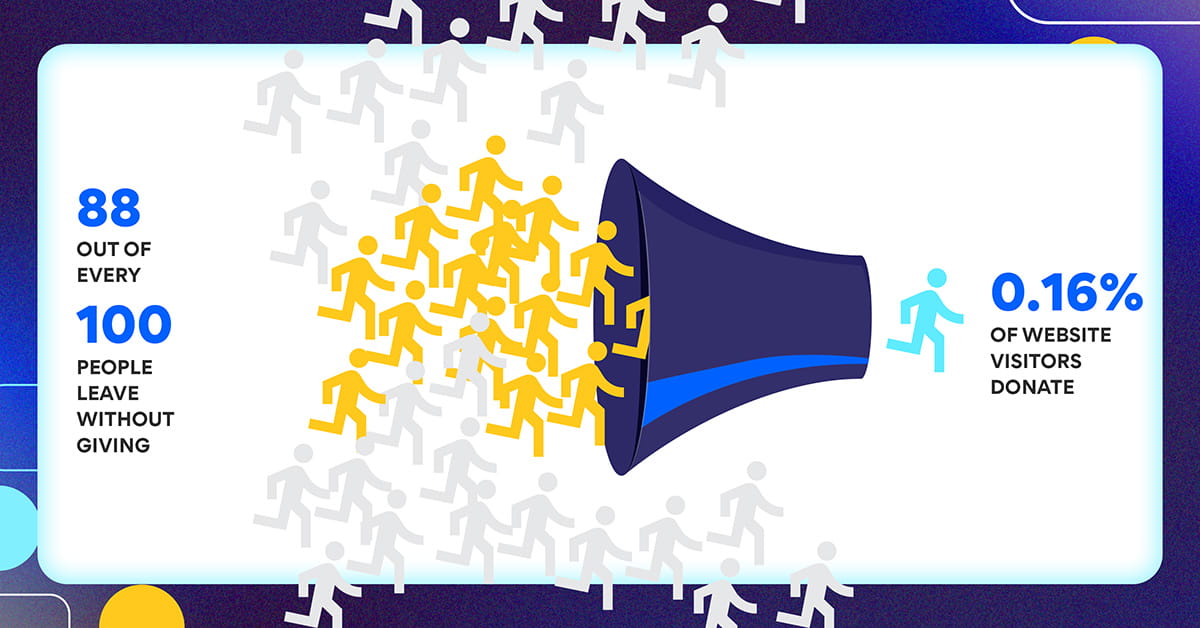
The M+R Benchmarks 2025 report, which analyzed data from 216 nonprofit organizations, found that donation page completion rates average just 12%. That means 88 out of every 100 people who reach a nonprofit’s donation page leave without giving. For online traffic overall, only 0.16% of website visitors donate, generating an average of $1.29 per visitor.
These are structural failures, not marketing failures. And they are recoverable.
This article identifies the three friction points where nonprofits consistently lose donors, outlines a UX diagnostic framework, and describes what well-executed redesigns actually produce in measurable revenue terms.
The Three Friction Points Where Donors Disappear
Most nonprofit websites fail donors at one of three moments.
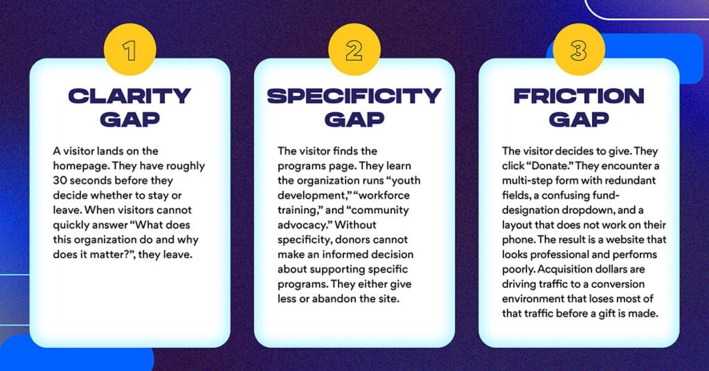
The clarity gap.
A visitor lands on the homepage. They have roughly 30 seconds before they decide whether to stay or leave. The Nielsen Norman Group’s research on nonprofit website usability found that only 43% of nonprofit sites stated their mission on the homepage, and only 4% explained how donations would be used. When visitors cannot quickly answer “What does this organization do and why does it matter?”, they leave.
The specificity gap.
The visitor finds the programs page. They learn the organization runs “youth development,” “workforce training,” and “community advocacy.” But they cannot learn what those terms mean in measurable terms: how many participants, what outcomes, at what cost. NNg found it took users an average of six minutes to locate an organization’s purpose information, five times longer than the one-minute standard for effective navigation. Without specificity, donors cannot make an informed decision about supporting specific programs. They either give less or abandon the site.
The friction gap.
The visitor decides to give. They click “Donate.” They encounter a multi-step form with redundant fields, a confusing fund-designation dropdown, and a layout that does not work on their phone. Research consistently places donation form abandonment rates between 60% and 83%, with the most commonly cited causes being excessive form length, mandatory account creation, and lack of mobile optimization.
The result is a website that looks professional and performs poorly. Acquisition dollars are driving traffic to a conversion environment that loses most of that traffic before a gift is made.
What to Measure: The UX Diagnostic Framework
Before redesigning, the priority is knowing precisely what is broken. That requires a diagnostic framework combining quantitative analytics, qualitative session research, and competitive benchmarking.
Start with GA4 analytics.
Implement event tracking on five critical pages and user flows:
- Homepage exits: what percentage of visitors leave without clicking anything?
- Program page engagement: how long do donors spend on each program page, and where do they scroll?
- Donation form abandonment: what percentage start the form but do not complete it?
- Mobile versus desktop conversion: do mobile visitors convert at the same rate?
- Traffic source performance: which channels drive visitors who actually donate?
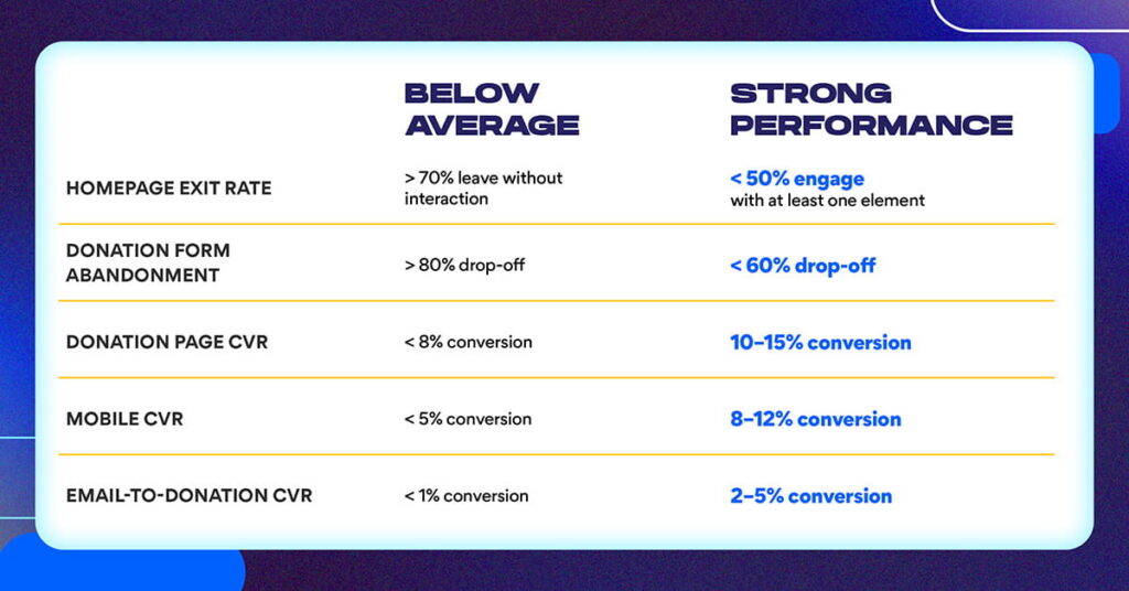
Per M+R Benchmarks 2025, the average nonprofit donation page converts at 12% overall, with desktop at 11% and mobile at 8%. If your form abandonment is substantially higher than these benchmarks, the form is the problem. Traffic quality is not.
Layer in qualitative data.
Analytics reveal what happened; qualitative research explains why. Session recording tools like Microsoft Clarity (free) or Hotjar show exactly where donors click, where they hesitate, and where they scroll away. Watching 10–15 session recordings of donation page visits typically reveals three to five common failure points that analytics alone would never surface.
Pair session recordings with a brief post-visit survey: “Why did you leave without donating?” or “What information would have helped you give today?” The answers are almost always simple: “I didn’t understand where my money goes,” “The form was too complicated,” or “I couldn’t find the program I wanted to support.”
Benchmark against comparable organizations.
Audit five peer organizations with strong reputations for digital performance. What do their homepages do that yours does not? Where are their donation pages simpler? What program page structure do they use? Taking notes on what works elsewhere informs the redesign with evidence rather than preference.
The Redesign Framework: Strategy Before Design
The most common reason nonprofit redesigns fail to improve conversion is skipping the strategy phase. Organizations go directly from “the site needs a refresh” to “let’s pick a new template,” without defining what success looks like in measurable terms.
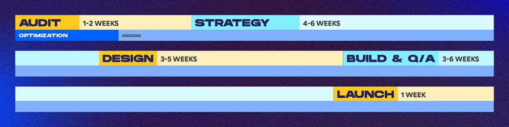
Strategy phase (4–6 weeks).
Define three things before any design work begins: the two to three biggest friction points identified through the diagnostic, the specific conversion goal (example: “increase donation page completion from 12% to 18%”), and the timeline and ownership structure. Without a defined conversion goal, there is no way to measure whether the redesign worked.
Design phase.
Once strategy is defined, the redesign focuses on friction reduction:
- Homepage redesign: lead with mission clarity and one to three impact metrics on the first visible screen
- Program pages: standardize structure so every program tells the same story: what it does, who it serves, how many participated, and one key outcome metric
- Donation form: reduce to three steps maximum with pre-populated fund designations tied to specific outcomes, not general operating categories
- Renewal pathway: create a distinct “Give Again” experience for prior donors at the 12-month mark that does not treat them as new visitors
On mobile specifically: M+R Benchmarks 2025 shows mobile converts at 8% versus desktop at 11%, a 27% performance gap. NextAfter’s A/B testing research found that making the Donate button visually prominent increased donation page traffic by 25%. Given that mobile traffic now constitutes the majority of nonprofit web traffic, closing this gap is one of the highest-leverage optimization opportunities available.
Research from iDonate found that at a four-second page load time, conversion rate drops by more than 450% compared to a one-second load. If your donation page loads slowly on mobile, the form friction is almost irrelevant. Most mobile users have already left.
Build and QA.
Develop the site, test all forms and payment processing across devices, implement GA4 event tracking before launch, and confirm mobile performance on actual devices, not emulators.
Launch and iterate.
Going live opens the optimization phase. Establish baseline metrics in the first 30 days, and begin A/B testing in month two.
What High-Performing Redesigns Produce
Nonprofits that execute this diagnostic-first, friction-reduction framework see measurable gains across four areas:
Donation page conversion improves by 50–100% when friction is addressed systematically. A 12% completion rate moving to 18–24% represents a substantial revenue difference on the same traffic volume.
Average gift size increases when outcome-linked giving options replace generic “General Fund” designations. NextAfter’s testing research found that adding outcome-specific value proposition copy to donation pages increased donations by up to 258%. Donors give more when they know exactly what they are funding.
Prior-donor renewal rates improve when the website treats returning donors differently from new visitors. Retention-focused UX, including personalized messaging, pre-filled forms, and outcome reminders, converts renewal decisions that would otherwise default to inaction.
Cost per acquisition drops as site efficiency reduces dependence on paid media to compensate for low organic conversion.
The Nielsen Norman Group’s landmark research on nonprofit donation usability estimated that nonprofits could “easily double donations” by addressing the usability factors that turn donors away. Even modest improvements (fixing a slow load time, simplifying a form, making the donation button findable) can add meaningful revenue without increasing traffic. NNg’s estimate: fixing minor usability problems might increase donations by 10%, and for a nonprofit with a $10M budget, that represents an additional $100,000 per year.
Common Mistakes to Avoid
Prioritizing aesthetics over friction.
A visually updated site with the same broken form produces an updated site with the same broken form. Friction is the lever, not visual design.
Launching without measurement infrastructure.
Without GA4 event tracking live before launch, there is no baseline against which to measure improvement. Implement analytics before the site goes live.
Treating redesign as a one-time event.
Organizations that launch and stop optimizing typically see initial conversion gains plateau within six months. The sites that continue improving are the ones running monthly A/B tests on high-traffic pages.
Unclear fund designations.
“General Fund” donation options leave money on the table. Pre-populate giving options with outcomes: “Your $100 provides two students with textbooks for a semester.” Specific outcome language drives higher average gifts.
Ignoring the renewal pathway.
Most nonprofit websites treat all visitors identically. Prior donors — the highest-probability conversion segment — receive the same new-visitor experience as someone who has never heard of the organization. A distinct renewal experience for donors who gave in the past 12–18 months is one of the least-used and highest-return UX investments available.
The 6-Month Roadmap
Month 1: Audit and Strategy
Measure current performance using GA4 and session recordings. Identify top three friction points. Define success metrics and conversion targets. Output: strategic brief.
Months 2–3: Design and Approval
Create wireframes for homepage, program pages, and donation flow. Test with real users (even five to ten user sessions reveal significant patterns). Get stakeholder sign-off. Output: approved design system.
Month 4: Build and QA
Develop the site. Implement analytics. Test across devices and browsers with real payment processing. Output: launch-ready site.
Month 5: Launch and Monitoring Deploy.
Monitor real-time performance. Execute a donor launch communication. Establish 30-day baseline metrics. Output: successful launch.
Month 6 and beyond: Optimization Monthly performance reviews.
A/B testing on high-traffic pages. Quarterly strategy sessions reviewing conversion data against targets. Output: continuous improvement.
Frequently Asked Questions
What is the typical cost of a nonprofit website redesign?
A full redesign including strategy, design, build, testing, and launch typically costs $20,000–$50,000 depending on complexity and scope. A phased approach (homepage and core pages first, program pages second) can be completed in three to four months for $12,000–$25,000. Annual maintenance and optimization typically costs 10–15% of initial build cost.
How long does it take to see ROI?
Measurable performance gains in conversion and form completion typically appear within 30–60 days of launch. Retention impact becomes clear at the 12-month mark when donor cohort renewal windows align. Full ROI realization typically occurs by month six to nine.
What analytics should we track after launch?
Track seven core metrics: homepage exit rate, donation page traffic and conversion rate, form abandonment rate, mobile versus desktop conversion gap, program page engagement (time on page and scroll depth), email-to-donation conversion, and prior-donor renewal rate at 12 months.
Should we redesign everything at once or phase it?
A phased approach typically outperforms a full redesign because it launches faster, generates performance data earlier, and reduces risk. Priority order: homepage (mission clarity and impact metrics), donation page (friction reduction), program pages (standardized structure), email integration and renewal pathway.
How do we know if UX is actually causing donor loss?
Run a diagnostic using this framework: measure form abandonment rate (if 40%+ abandon the donation form before completing, UX is a primary problem), watch session recordings (observe where donors hesitate or click away), compare your conversion rate to the 12% M+R benchmark (below-average performance is a flag), and conduct post-visit surveys asking why visitors did not give.
What role does mobile experience play?
Mobile traffic constitutes the majority of nonprofit web visits, and mobile conversion rates are structurally lower than desktop due to form friction and page load times. Redesigns implementing mobile-first forms (single column, large touch targets, minimal required fields) see mobile conversion improve significantly. Always test donation forms on physical mobile devices.
Should we A/B test the donation page after launch?
Yes. A/B testing on the homepage, donation page, and program pages should become a quarterly practice. High-impact tests to start: outcome-specific versus general fund designation language, CTA button copy, suggested giving amounts, and required versus optional form fields. Run tests for two to four weeks and measure conversion impact before scaling winning variants.
Ready to Build a Website That Converts
Black Digital works with nonprofits, associations, higher education institutions, and mission-driven organizations to build web ecosystems that turn existing traffic into measurable action.
If your donation page conversion is below sector benchmarks, if form abandonment is eating the revenue your acquisition campaigns are generating, or if you have never run a UX diagnostic on your website’s most critical pages, we can help you identify exactly where the losses are occurring and build toward a site that performs.
Schedule a free 30-minute web strategy conversation. We will review your current website performance, identify your highest-leverage friction points, and outline what a conversion-focused redesign would look like for your organization.