We partnered with PGCFCU to deliver a brand refresh that honored their legacy tree logo while building a modern, scalable identity for today’s members.
Overview
Prince George’s Community Federal Credit Union serves the financial needs of members across Prince George’s County, Maryland. Following a period of significant growth, including the opening of a new Greenbelt branch, the organization sought to modernize its brand identity and more clearly communicate its expanding reach and commitment to the entire county. Black Digital partnered with PGCFCU to lead the full rebrand, from strategy through final delivery.
Challenge
A credit union rebrand carries real institutional weight. The new identity had to feel modern and forward-looking while honoring the trust members had built with the organization over decades. The previous logo had emphasized “community,” while the new direction needed to shift focus to “Prince George’s,” reflecting the credit union’s growing presence across the county beyond its four brick-and-mortar locations.
Approach
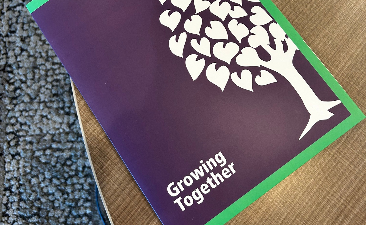
We led PGCFCU through our three-phase Logo Design Process: Intake & Discovery (brand strategy, competitive review, creative direction), Visual Design (concept development, rounds of refinement, client review), and Finalize & Deliver (production-ready files for digital and print). The final identity retained the original tree icon as a nod to being rooted in the community, while introducing a heart-shaped leaf favicon symbolizing the credit union’s role as the heart of the Prince George’s County community. A refined purple and green color palette was carried through, and a full brand style guide with typography guidelines and usage standards was delivered alongside presentation materials for the organization’s annual meeting.
Impact
The rebrand was covered by the Maryland/DC Credit Union Association, which noted that the updated design highlights “Prince George’s” while retaining the credit union’s signature purple and green color palette. PGCFCU President and CEO Diane Coleman Brown described the refresh as a symbol of the credit union’s “unwavering commitment to the residents and businesses of Prince George’s County.” The new identity has been adopted across all member-facing materials and communications.